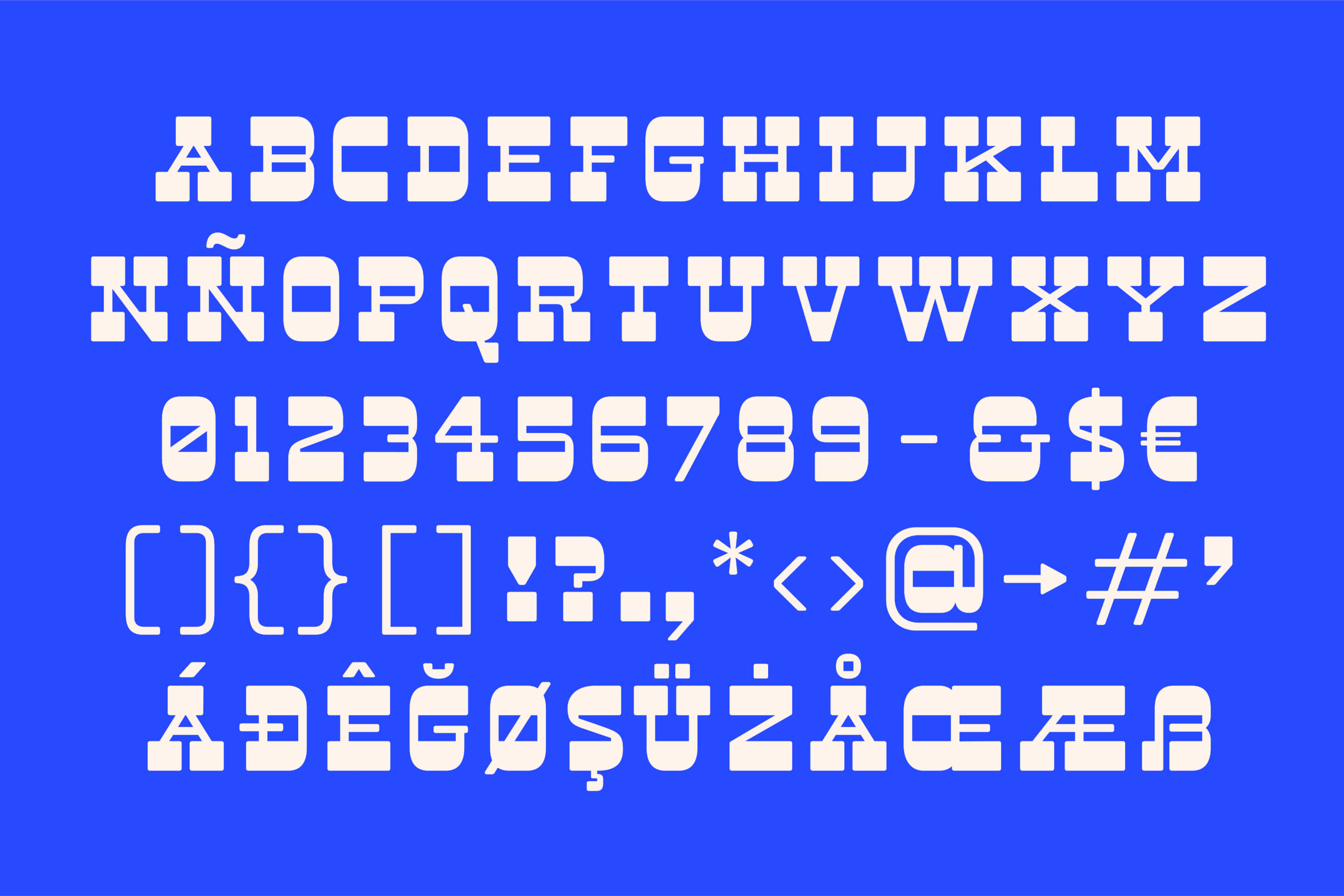
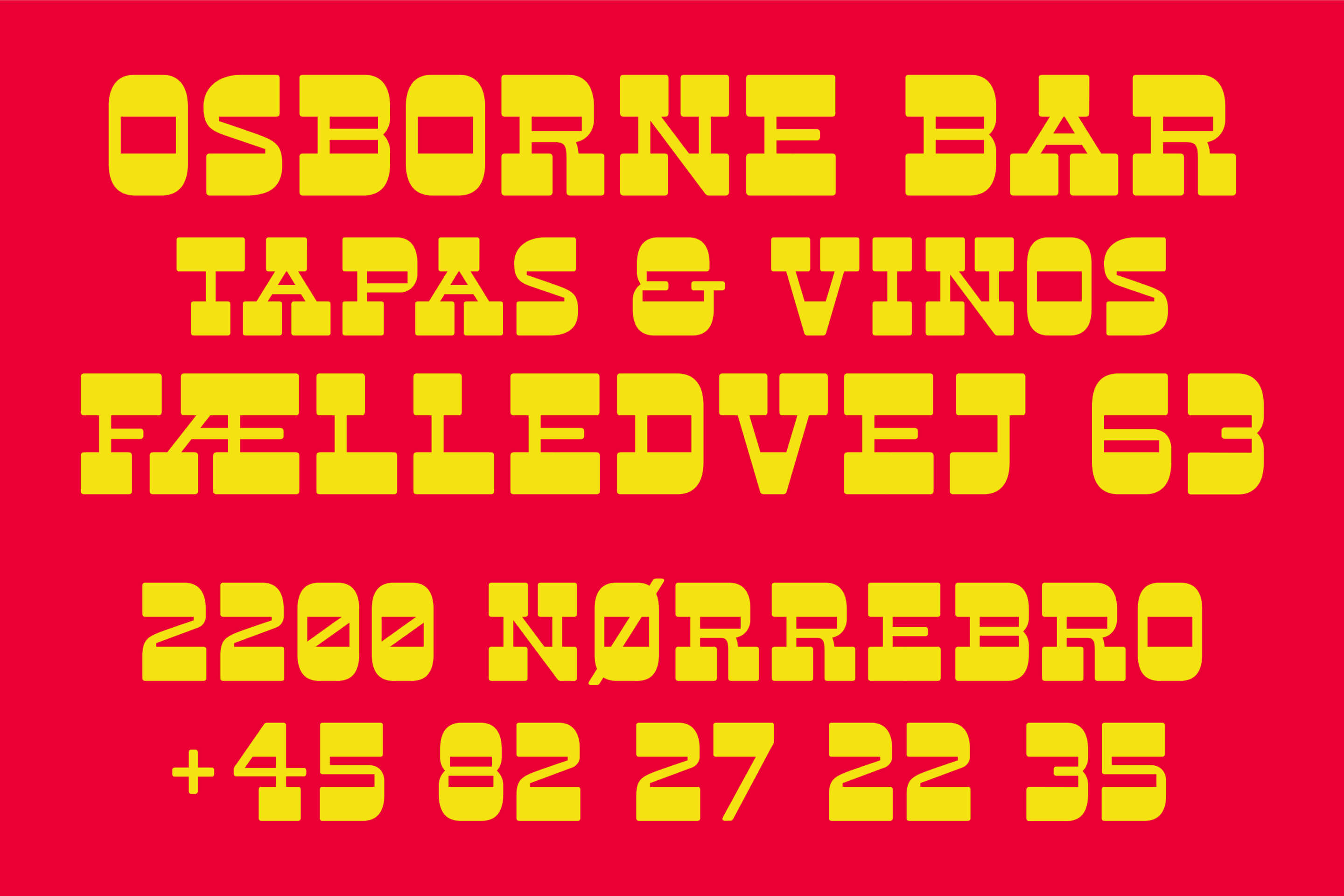
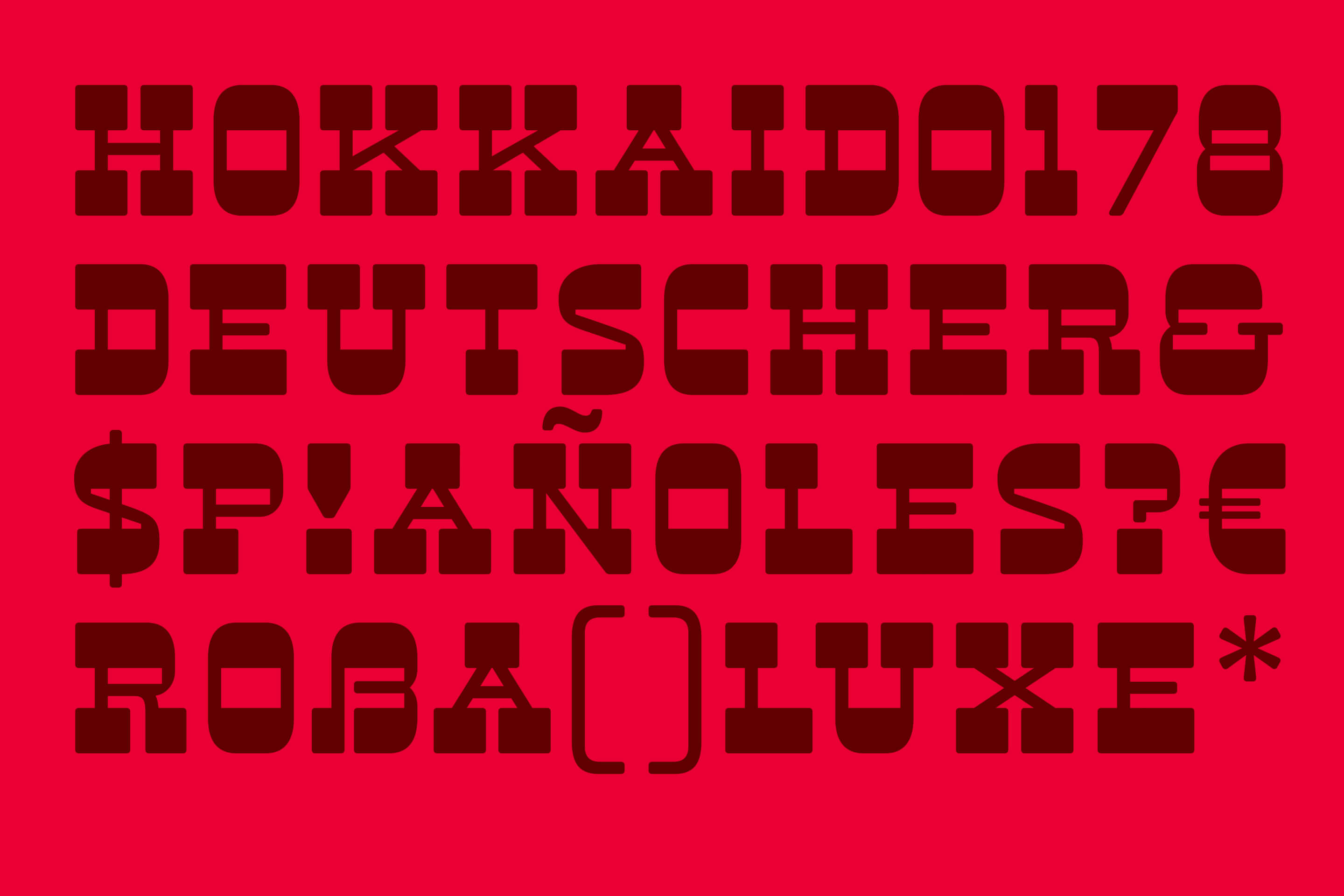
Staying true to the idea of simplicity, this typeface keeps things straightforward — no extra decoration, just bold, clean lines. It’s eye-catching, unique, and, despite its bulky look, works surprisingly well even in small sizes.
** try me here **
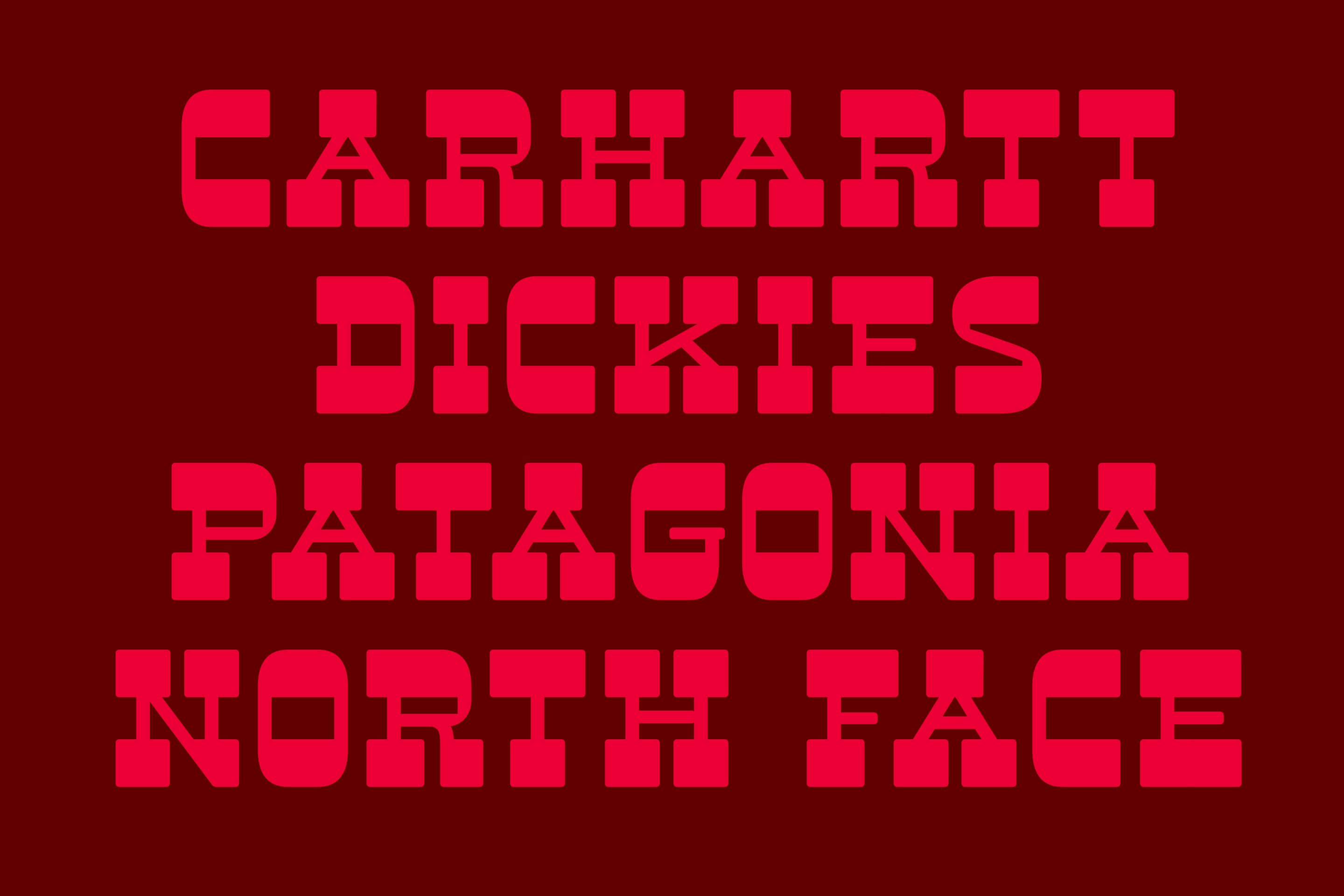
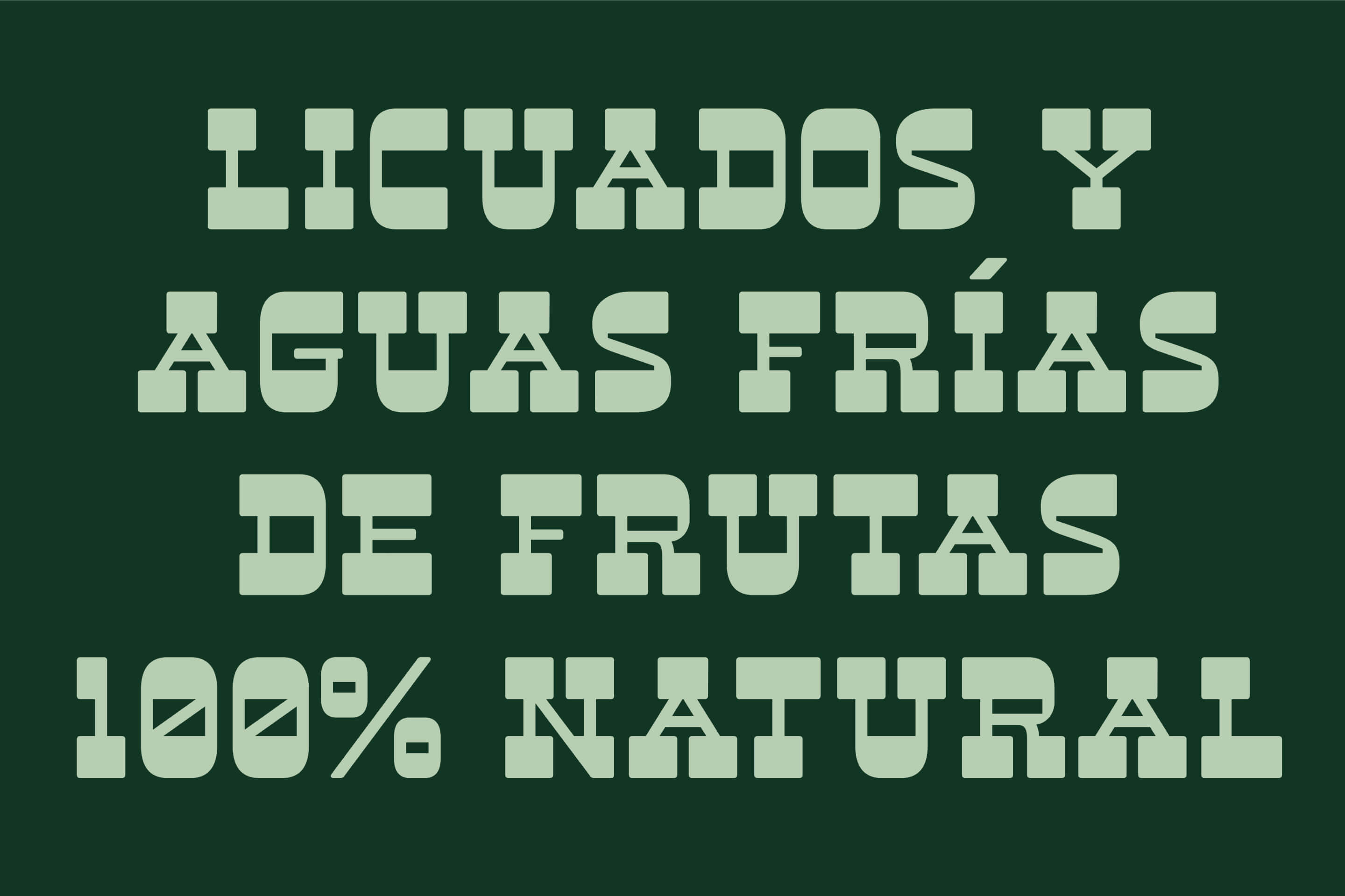
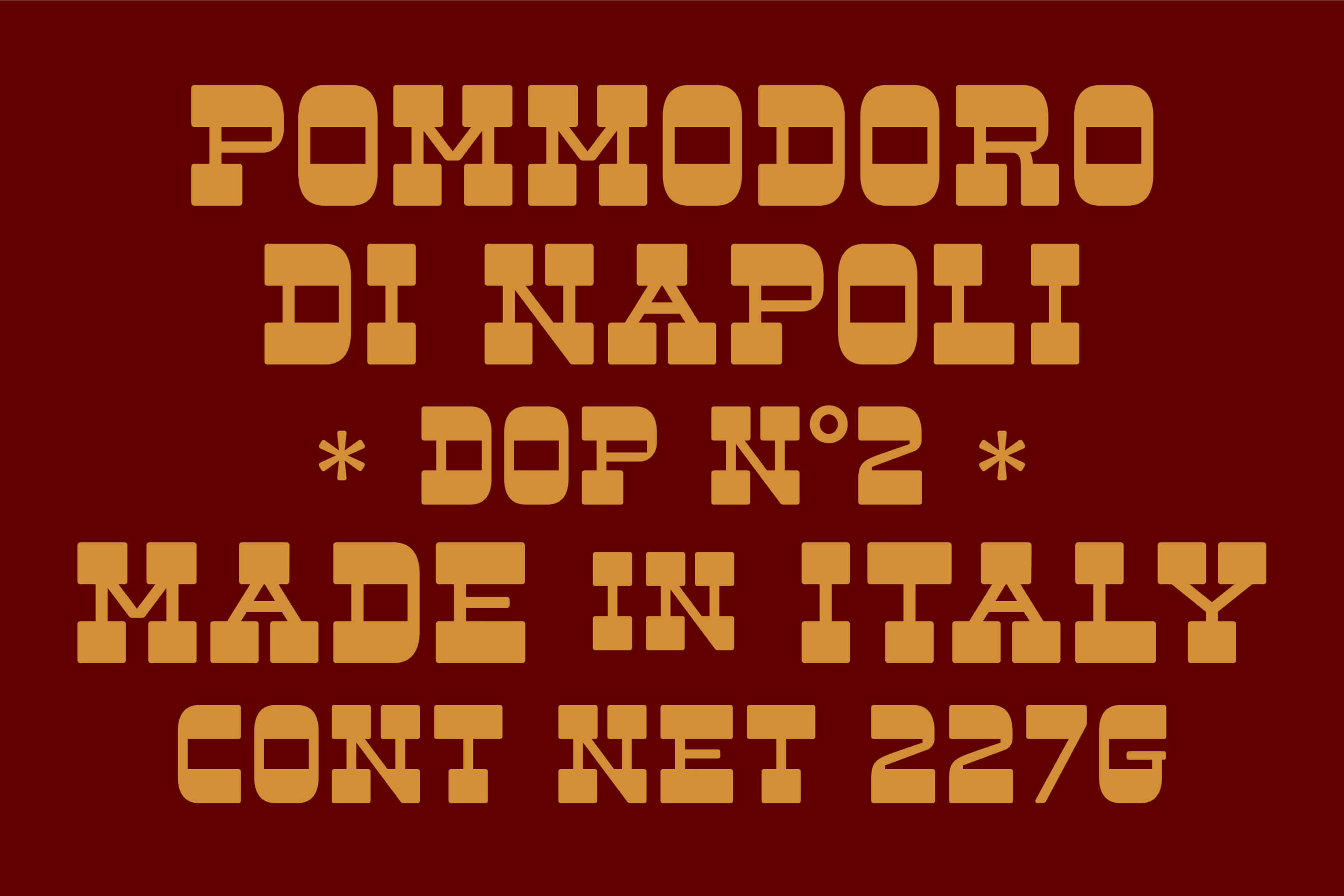
→ stark! ¡muy duro! ←
‘‘ bold but friendly, 0123456789 ß & @ , probando ’’
Lessons learned
Brutus is my first typeface, and the process was much harder and took way longer than I expected. Designing a font isn’t just about making letters — it’s about balance, consistency, and countless small adjustments. Stripping away unnecessary details while keeping personality and functionality intact was a real challenge, but one that made the typeface stronger.
Brutus is still a work in progress. I’m still refining it, and my goal is to submit it to Google Fonts by the end of 2025 — stay tuned!