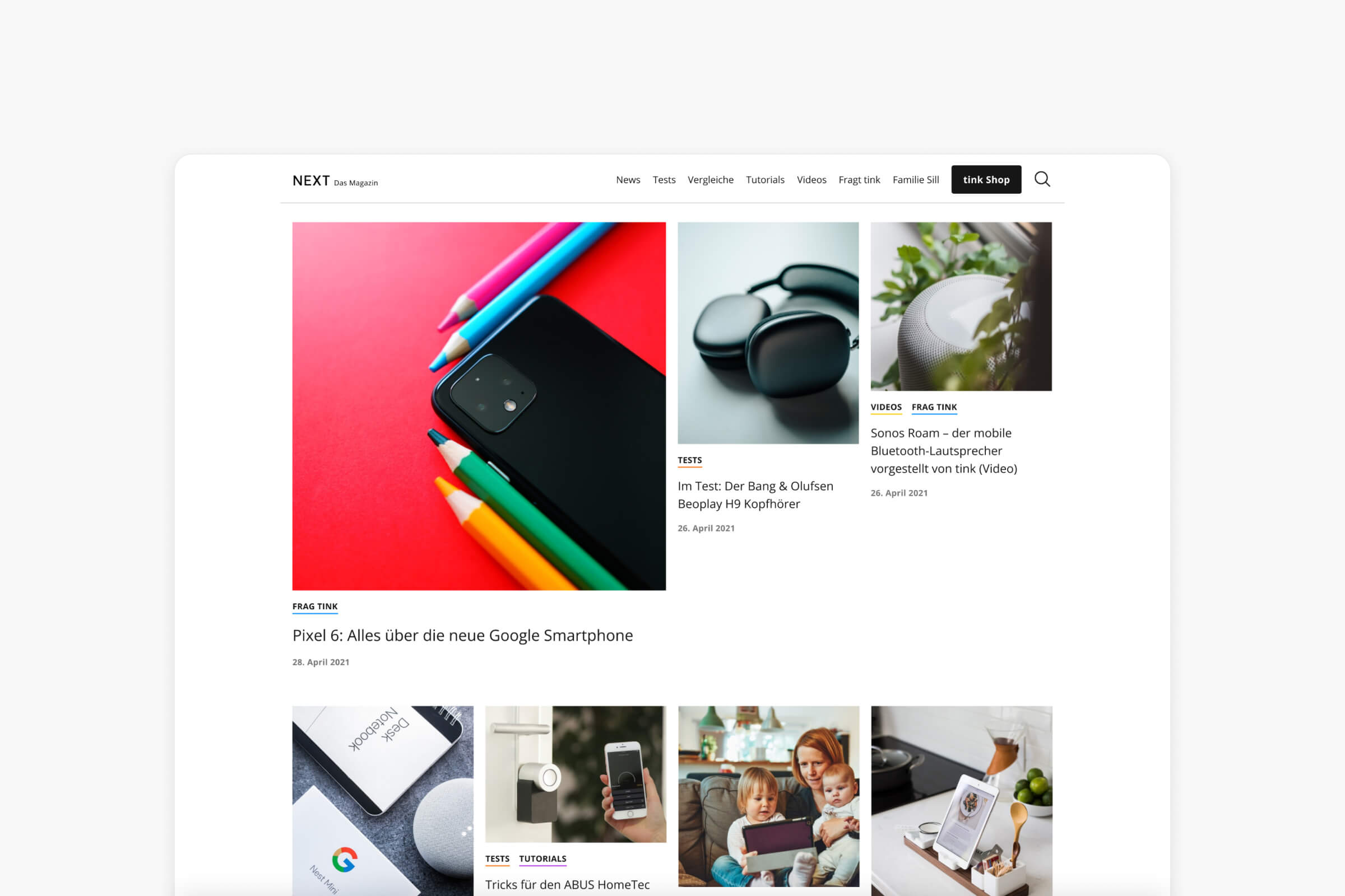
Refreshing the company blog for a better user experience
The problem
When the dev team suggested creating a new custom template from scratch, we saw it as a perfect opportunity to address some UX issues and update the overall look to align with our current design guidelines.
While the user flow in the blog was fine, the typography was poorly set, making it difficult and unpleasant for our readers. Low-contrast colors, light-weight type, and excessive line-height... reading our articles was not a joy.
The second issue was with the overall appearance of the blog. The typography, the secondary colors, design patters...they dind‘t match match our guidelines at all. It was time to update and give the blog a unified look.
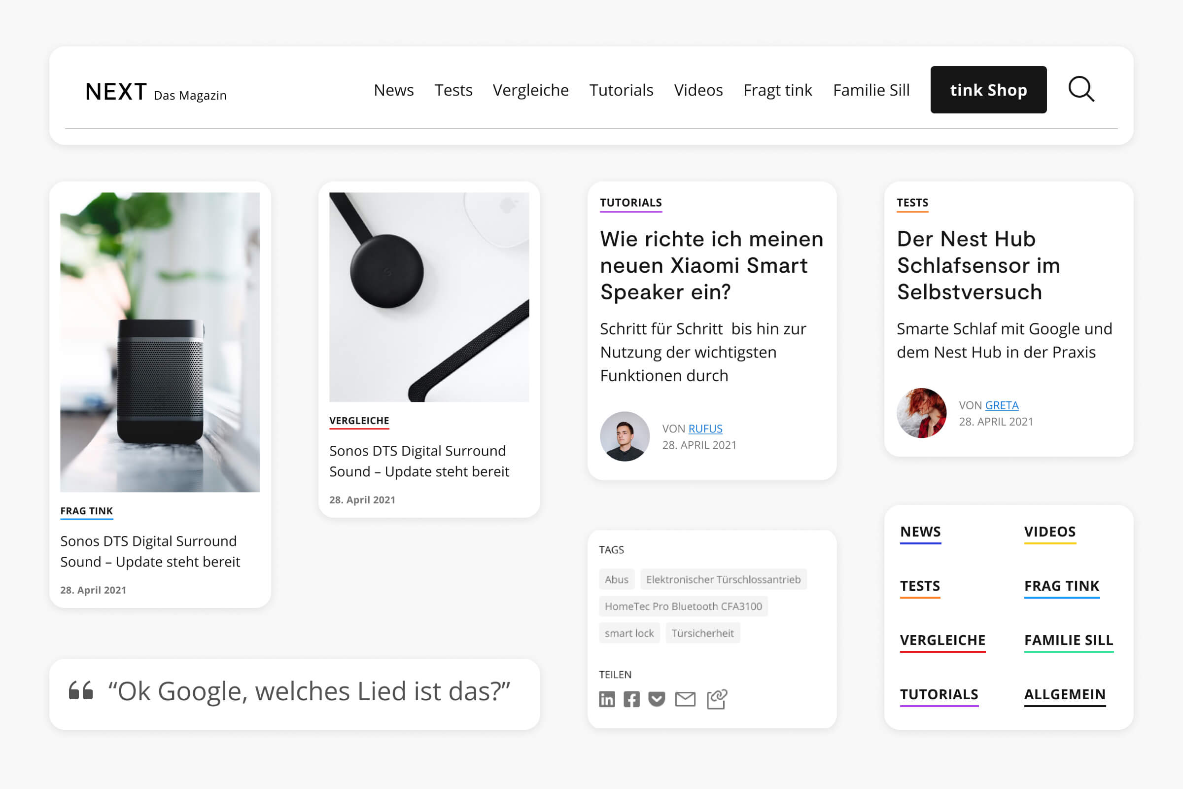

Solution
We collaborated with the content team to come up with a list of improvements and new features. We then created low-fidelity wireframes to explore different design options.
After multiple iterations and feedback from various teams, we settled on a design that met all our requirements.
The new design follows our design guidelines and it is much clearer, making it easier and more enjoyable to navigate and read the content for our readers.
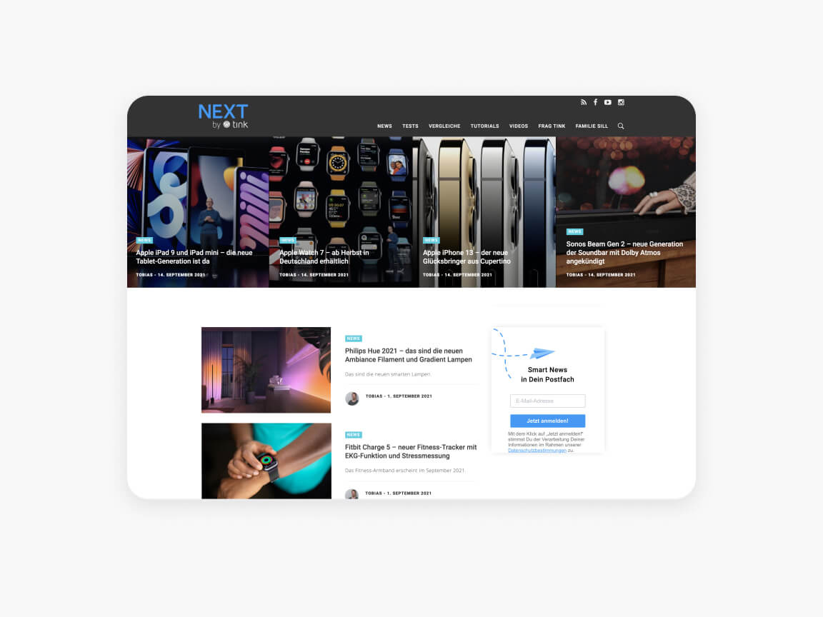
Previous homepage
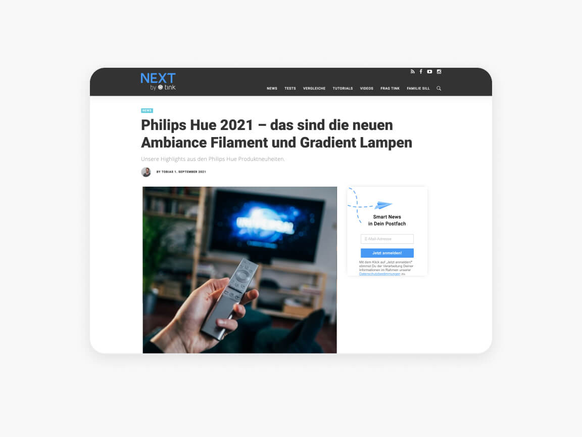
Previous article page
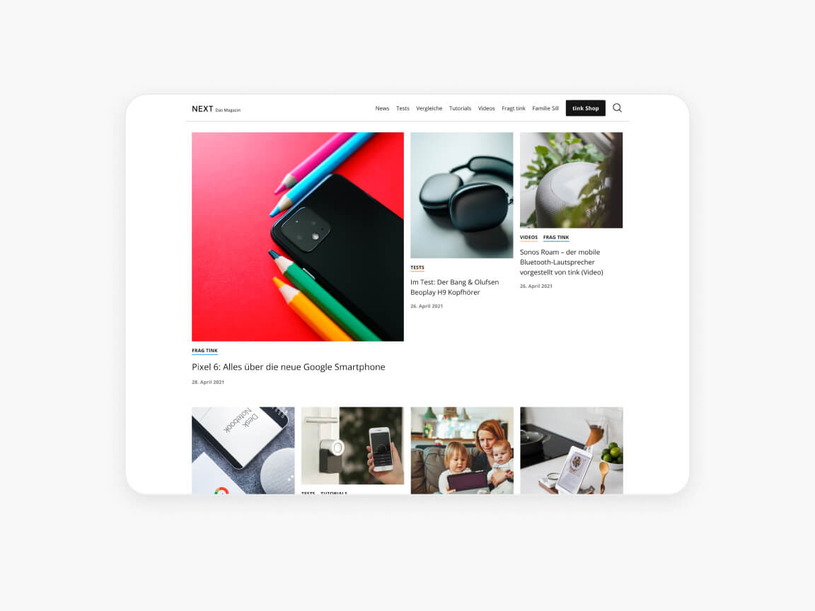
Homepage redesign
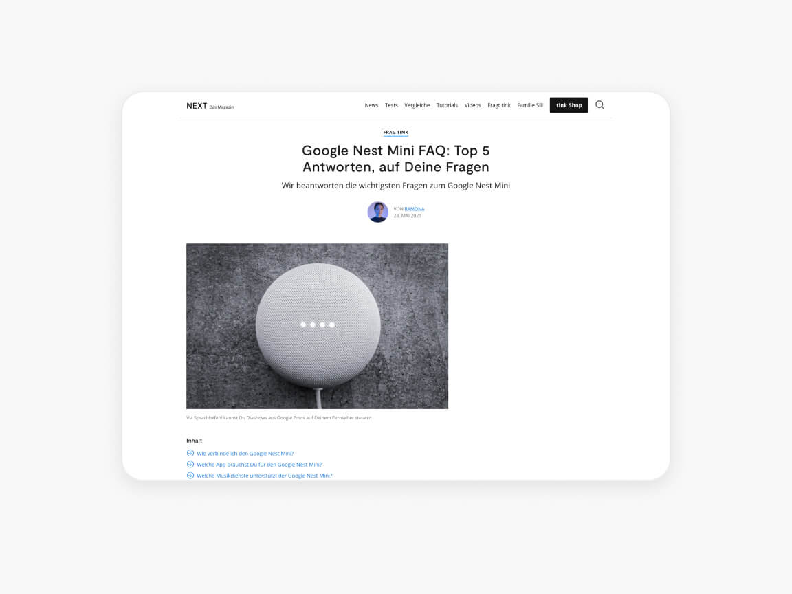
Article page redesign
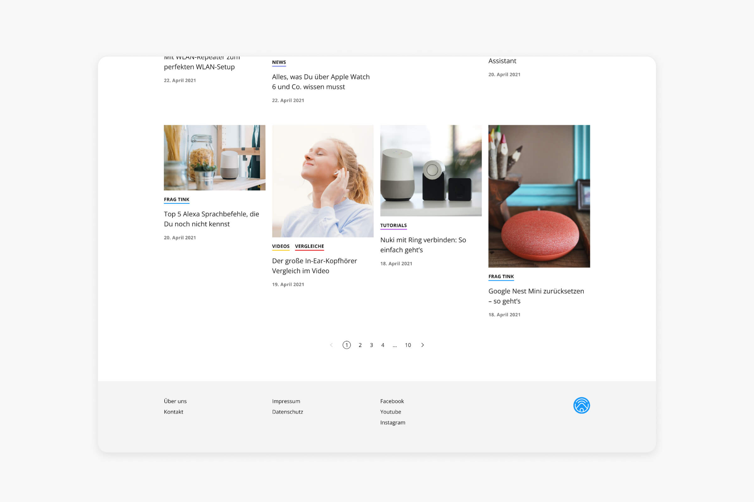
Since the relaunch, the number of readers increased by 23%
